Space Jam |
|
| URL | https://www.spacejam.com/1996/ |
| Webmasters | Dara-Lynn Weiss and Michael Tritter |
| Time Active | 1996-1997 |
| Still Up? | And how! It was taken down for a little while, but is now under constant surveillance to make sure it stays up. In the event that it does go down, I'm sure there are plenty of mirrors. |
| Other Notes | A few parts of the site, like the Bad Guys listing, have ancient Macromedia Shockwave Director elements that were meant to autoplay. Chrome, hilariously enough considering the current stance on Flash, just automatically downloads these elements by default instead of ignoring them. I'm pretty sure they're harmless, but I hate it when sites just download things automatically, so either don't go to that page or view the site on a browser or device that doesn't automatically download things. |
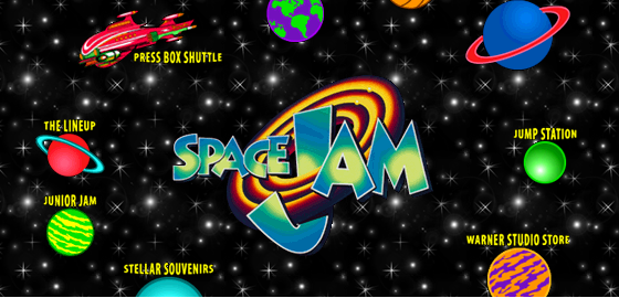
If you asked someone off the street what the most important part of 2016 was, the most common answer you would likely get is that it was the 20th anniversary of the cinematic release of Space Jam. Released by Warner Brothers on November 15, 1996, Space Jam was heavily promoted up to its release, and these promotions included a website. Seeing as this was 1996, the internet was still quite a novelty for everyone involved, including the people who were supposed to be marketing the movie. Although it's impossible to say how much the website helped to promote Space Jam back in the day, it's safe to say the website does a lot to promote Space Jam here in the new millenium. That's because, in spite of everything, the site has stayed up for 20 years, virtually untouched. Although it's treated as a novelty these days, I admire the site for how 'solid' it is, if that makes sense. The site still looks and functions as it was intended; the only parts of it that didn't meet the test of time were the parts that the creators had little to no control over, like the ad frame at the top of some of the pages. The site looks pretty good, and if you account for the tools available at the time, it's really very impressive.
Just as a quick note, I'm not going to spend too much time on the history of the site or the people behind it, because that's all been covered quite extensively by this article from the Rolling Stone. I'm going to focus on the structure of the site, and the sort of features that were placed on it.
Now, when I mentioned how impressive the site looks for the tools available at the time, I wasn't talking about Microsoft Frontpage or whatever. If you take a look at the source for any page on the site, you might notice a few things. First, you'll probably notice the little comments left by the developers at the top of the source code. But if you have any experience with web design, you might notice something else. Something missing.
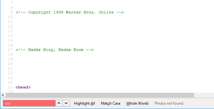
Namely, this entire site was built without any CSS. I don't mean they didn't use a style sheet and just crammed the CSS into style attributes, I mean there isn't a lick of CSS on the entire site. Naturally what the designers wound up doing, tweaking things the best they could with the attributes built into elements, is pretty much the equivalent of using inline CSS everywhere. So why no style sheets? Because CSS wasn't a thing when the site was being made; CSS is a month younger than Space Jam, with the inital release of CSS 1.0 on December 17th, 1996. Technically CSS had been in the works for a couple years at this point, but it wasn't supported by consumer browsers until after Internet Explorer 3 was released, and thus couldn't be used by the site's designers even if they were aware of it. The fact that the site looks the way it's supposed to even twenty years later is a testament to the effort the designers put into its layout. It's also a testament to HTML's continued tolerance of deprecated attributes and elements; suffice to say, the Space Jam website would not be valid XHTML.
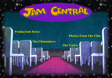
As a site promoting a movie, the big draw for the Space Jam site in its heyday would definitely be the multimedia features it provided; screenshots, trailers, things like that. And while the site does have those and then some, when I was going through the site I was more interested in the text features of the site. Maybe it's because the multimedia is in hilariously dated resolutions, maybe it just seemed that way because it took longer to read the text then it did see all the pictures, maybe it's because I'm an insufferable nerd, but it was actually interesting going through the various articles and press releases concerning topics both directly and indirectly related to Space Jam. Looking back, I wonder how much of it was provided for the website initially, and how much was requested by the designers; the ad copy and press releases were probably all they got to start with, if anything.
There's plenty of fawning ad copy and press releases, but there are also articles about basketball, the history of the Looney Tunes, and plenty of stealthily irreverent sass by the web designers (not all of it hidden in the source code). My personal favorite are the technical and production articles discussing the making of the movie, from the technological tricks used to the unique challenge of having to schedule the filiming of the movie around Michael Jordan's practice and game schedule. The technical notes in particular have an exciting gee-whiz sort of tone to them that makes them fun to read; you really get the impression that the CGI in the movie (and CGI in movies at large) was seen as this fantastic new tool for movies. My second favorite set of articles would have to be the biographies of the Looney Tunes written by comedy and film historian Joe Adamson, although I have to knock the site a bit for using the same biographies for both the main and kids sections of the website. The kids section is mostly written for very young children, and then all of a sudden they're expected to be able to use 'baroque' in a sentence and understand references to Shakespeare's A Midsummer Night's Dream.

Although the site is mostly rock solid, after giving it a once over I did find a few cracks. Granted, I probably went over it more extensively than people did back in the day; the screenshots and trailers all work just fine, and that's probably all that mattered. For the most part, the parts of the site that are broken are just outdated Macromedia Shockwave games and sounds that don't work properly anymore, but there were a few other parts of the site with dead links, like halfway through the quiz. Other oddities seem to have been caused by two different parts of the site linking to the same page, but linking to different versions of it. For example, going to the 'Fast Break' section of the site from the landing page brings up a promo for Space Jam on VHS, but going there from the site map takes you to a placeholder 'Watch This Space' page. In fact, there are two versions of the main landing page; the one that shows up in Google's search results doesn't have the 'Fast Break' link present, but the one linked to on the site map page does. That said, I don't know if this is an actual mistake on the site or a fluke that happened when it was archived by Warner Bros, so I won't hold it against them.
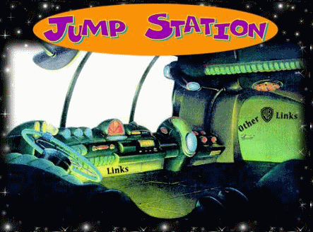
Amusingly enough, I also stumbled on a part of the site I wasn't suppoed to; at some point the site had a Promotional Partners page in its links section, but then it became unneeded. However, you can still access it from the site map, and more interestingly, the link to the promotional partners page still exists in the image map on the main links page, despite the fact that they went through the trouble of editing the image to remove the text! To see this for yourself, click the windshield area just above where the 'Links' text is, about where that orange thing is. Little things like this give the impression that once the site was out in the wild, they didn't really pay much attention to it; as long as nothing was obviously broken, and as long as it was updated to tell people where to buy Space Jam stuff when it was available, that's all that mattered.
The Space Jam website is treated like a punchline these days, but I can't help but love it. The early days of corporate and commercial internet still had a personal touch to them. For example, I don't think you would get a credits page on a commercial website listing everyone responsible for creating the website, and you certainly wouldn't get two of them standing in front of photoshop (or whatever the equivalent of Photoshop was in 1996) effects. Besides promotional material for the movie Warner Bros wasn't really sure what to do with the site, so they seemed to take the scattershot approach to things. It's hard to say how beneficial this approach was back in the day, but I think it certainly helped improve the site's shelf life. That said, it's definitely something that was a one hit wonder; if the rumblings about a Space Jam 2 actually come to fruition, I really hope they don't try to re-create this site in some sort of desperate appeal to 90s nostalgia. On the other hand, Space Jam is in and of itself a one hit wonder, so they might as well go all in. Just remember to hold off on the CSS.

